Logo refresh.
Role: Branding, Design
PBSI is a human resource company that takes all the hassle of hiring, payroll and tax prep off a business owner's plate so the owner can focus on the part of their business they're experts in.
Logo Design
Sometimes a logo starts to feel like shag carpet or an avocado colored refrigerator. There's nothing necessarily wrong with it, but it could use a bit of an update. That's the place PBSI found themselves. I took some elements from their old logo - it had building block shapes that offered some possibilities - and incorporated them in the new design. I also came up with the tagline, throwing a couple periods in there to give the phrase a relevant double meaning. PBSI has since transformed in to Kaya. I designed that logo too.
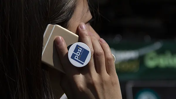
Sub Logos
Within the PBSI brand are a number of services that could benefit from having logos of their own. I worked up this subset, picking a typeface with lots of flexibility and a wide, complimentary pallet. Astute observers will note that the tittle in "Solutions" is a callback to the main logo.

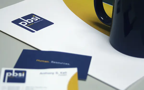
Printed collateral
A new logo means new collateral. I created business cards, brochures and a full range of envelopes. Most of this was printed offset, but not all. I made sure the new color pallet converted well from Pantone to CMYK. The amount of print files I get from other designers set up in RGB would blow your mind. Nothing makes a designer's job easier than making your printer's job easier.